


| Главная » Файлы » Скрипты плагины и дополнения » Разное |
3d эффект бумажные кнопки
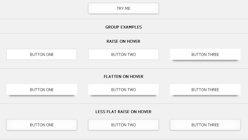
Для начала HTML: Код <link href='http://fonts.googleapis.com/css?family=PT+Sans' rel='stylesheet' type='text/css'> <h2 class="no-separator">Raise on hover from flat</h2> <a href="" class="btn paper-raise">Try Me</a> <h2>Flatten on hover from raised</h2> <a href="" class="btn paper paper-raise-flatten">Try Me</a> <h2>Raise from Less flat position on hover</h2> <a href="" class="btn paper paper-raise">Try Me</a> <h2>Lift sides on Hover</h2> <a href="" class="btn paper-lift">Try Me</a> <h2>Flatten sides on hover</h2> <a href="" class="btn paper-flatten">Try Me</a> <h2>Curl right corner on hover</h2> <a href="" class="btn paper paper-curl-right">Try Me</a> <h2>Curl right side on hover</h2> <a href="" class="btn paper paper-curl-right-side">Try Me</a> <h2>Curl bottom corners on hover</h2> <a href="" class="btn paper paper-curl">Try Me</a> <h2>Group examples</h2> <h2>Raise on hover</h2> <ul> <li><a href="" class="btn paper-raise">Button One</a></li> <li><a href="" class="btn paper-raise">Button Two</a></li> <li><a href="" class="btn paper-raise">Button Three</a></li> </ul> <h2>Flatten on hover</h2> <ul> <li><a href="" class="btn paper paper-raise-flatten">Button One</a></li> <li><a href="" class="btn paper paper-raise-flatten">Button Two</a></li> <li><a href="" class="btn paper paper-raise-flatten">Button Three</a></li> </ul> <h2>Less flat raise on hover</h2> <ul> <li><a href="" class="btn paper paper-raise">Button One</a></li> <li><a href="" class="btn paper paper-raise">Button Two</a></li> <li><a href="" class="btn paper paper-raise">Button Three</a></li> </ul> <h2>Lift sides on hover</h2> <ul> <li><a href="" class="btn paper-lift">Button One</a></li> <li><a href="" class="btn paper-lift">Button Two</a></li> <li><a href="" class="btn paper-lift">Button Three</a></li> </ul> <h2>Flatten sides on hover</h2> <ul> <li><a href="" class="btn paper-flatten">Button One</a></li> <li><a href="" class="btn paper-flatten">Button Two</a></li> <li><a href="" class="btn paper-flatten">Button Three</a></li> </ul> <h2>Curl right corner on hover</h2> <ul> <li><a href="" class="btn paper paper-curl-right">Button One</a></li> <li><a href="" class="btn paper paper-curl-right">Button Two</a></li> <li><a href="" class="btn paper paper-curl-right">Button Three</a></li> </ul> <h2>Curl right side on hover</h2> <ul> <li><a href="" class="btn paper paper-curl-right-side">Button One</a></li> <li><a href="" class="btn paper paper-curl-right-side">Button Two</a></li> <li><a href="" class="btn paper paper-curl-right-side">Button Three</a></li> </ul> <h2>Curl bottom corners on hover</h2> <ul> <li><a href="" class="btn paper paper-curl">Button One</a></li> <li><a href="" class="btn paper paper-curl">Button Two</a></li> <li><a href="" class="btn paper paper-curl">Button Three</a></li> </ul> CSS: Код @charset "UTF-8"; /* Base page styles */ body { font-family: 'PT Sans', sans-serif; background-color: #f1f1f1; text-align: center; } h2 { text-transform: uppercase; font-size: 16px; margin-bottom: 0; padding-top: 20px; border-top: 1px solid #ccc; } h2.no-separator { border: none; } ul { list-style: none; margin: 0 auto; padding: 0; text-align: center; } li { display: inline-block; margin: 0 20px; } /* Base Button Style */ .btn { position: relative; display: block; width: 250px; margin: 20px auto; padding: 10px; background-color: #fff; border: 1px solid #ccc; color: #000; text-align: center; text-decoration: none; text-transform: uppercase; transform-style: flat; transition: all 250ms ease-out; } .btn:before, .btn:after { content: ""; position: absolute; z-index: -2; transition: all 250ms ease-out; } /* Paper effect – slightly raised off background */ .paper { box-shadow: 0 1px 4px rgba(0, 0, 0, 0.3), 0 0 40px rgba(128, 128, 128, 0.1) inset; border-color: #dedede; } /* Raised effect – pushes up on hover */ .paper-raise:before { top: 0; left: 0; width: 100%; height: 100%; } .paper-raise:hover { border: 1px solid #fff; } .paper-raise:hover:before { box-shadow: 0 15px 10px -10px rgba(31, 31, 31, 0.5); } .paper-raise-flatten { border-color: #fff; box-shadow: none; } .paper-raise-flatten:before { top: 0; left: 0; width: 100%; height: 100%; box-shadow: 0 15px 10px -10px rgba(31, 31, 31, 0.5); } .paper-raise-flatten:hover { border-color: #dedede; } .paper-raise-flatten:hover:before { box-shadow: 0 1px 4px rgba(0, 0, 0, 0.3), 0 0 40px rgba(128, 128, 128, 0.1) inset; } /* Lift effect – lifts sides on hover */ .paper-lift:before, .paper-lift:after { bottom: 15px; width: 50%; height: 20%; max-width: 300px; max-height: 100px; box-shadow: 0 10px 10px rgba(31, 31, 31, 0.5); } .paper-lift:before { left: 8px; transform: rotate(-3deg); } .paper-lift:after { right: 8px; transform: rotate(3deg); } .paper-lift:hover { border-color: transparent; } .paper-lift:hover:before, .paper-lift:hover:after { box-shadow: 0 15px 12px rgba(31, 31, 31, 0.7); } .paper-lift:hover:before { left: 10px; } .paper-lift:hover:after { right: 10px; } /* Flatten effect – flattens sides on hover */ .paper-flatten { border: 1px solid transparent; } .paper-flatten:before, .paper-flatten:after { bottom: 15px; width: 50%; height: 20%; max-width: 300px; max-height: 100px; box-shadow: 0 15px 12px rgba(31, 31, 31, 0.7); } .paper-flatten:before { left: 10px; transform: rotate(-3deg); } .paper-flatten:after { right: 10px; transform: rotate(3deg); } .paper-flatten:hover { border-color: #ccc; } .paper-flatten:hover:before, .paper-flatten:hover:after { transition: box-shadow 600ms ease-out, left 200ms, right 200ms; box-shadow: 0 8px 8px rgba(31, 31, 31, 0.5); } .paper-flatten:hover:before { left: 5px; } .paper-flatten:hover:after { right: 5px; } /* Curl effects – curls corners on hover */ .paper-curl:before, .paper-curl:after, .paper-curl-right:before, .paper-curl-right:after { bottom: 12px; width: 50%; height: 55%; max-width: 200px; max-height: 100px; box-shadow: 1px 8px 12px rgba(31, 31, 31, 0.6); } .paper-curl:before, .paper-curl-right:before { left: 10px; } .paper-curl:after, .paper-curl-right:after { right: 10px; } .paper-curl:hover:before, .paper-curl:hover:after, .paper-curl-right:hover:before, .paper-curl-right:hover:after { box-shadow: 1px 8px 12px rgba(31, 31, 31, 0.8); } .paper-curl:hover:before, .paper-curl-right:hover:before { transform: skew(-8deg) rotate(-3deg); } .paper-curl:hover:after, .paper-curl-right:hover:after { transform: skew(8deg) rotate(3deg); } .paper-curl:hover { border-radius: 0 0 40% 40% / 0 0 30% 30%; } .paper-curl-right:before { display: none; } .paper-curl-right:hover { border-radius: 0 0 40% 0 / 0 0 30% 0; } /* Curl effects – curls right hand side on hover */ .paper-curl-right-side:before, .paper-curl-right-side:after { right: 10px; width: 50%; height: 55%; max-width: 200px; max-height: 100px; } .paper-curl-right-side:before { top: 12px; box-shadow: 1px -4px 12px rgba(31, 31, 31, 0.6); } .paper-curl-right-side:after { bottom: 12px; box-shadow: 1px 4px 12px rgba(31, 31, 31, 0.6); } .paper-curl-right-side:hover { right: 0; border-radius: 0 3% 3% 0 / 0% 50% 50% 0; } .paper-curl-right-side:hover:before { box-shadow: 10px -4px 12px rgba(31, 31, 31, 0.8); transform: skew(-8deg) rotate(-3deg); } .paper-curl-right-side:hover:after { box-shadow: 10px 4px 12px rgba(31, 31, 31, 0.8); transform: skew(8deg) rotate(3deg); } JS: Код /** * StyleFix 1.0.3 & PrefixFree 1.0.7 * @author Lea Verou * MIT license */ (function(){function t(e,t){return[].slice.call((t||document).querySelectorAll(e))}if(!window.addEventListener)return;var e=window.StyleFix={link:function(t){try{if(t.rel!=="stylesheet"||t.hasAttribute("data-noprefix"))return}catch(n){return}var r=t.href||t.getAttribute("data-href"),i=r.replace(/[^\/]+$/,""),s=(/^[a-z]{3,10}:/.exec(i)||[""])[0],o=(/^[a-z]{3,10}:\/\/[^\/]+/.exec(i)||[""])[0],u=/^([^?]*)\??/.exec(r)[1],a=t.parentNode,f=new XMLHttpRequest,l;f.onreadystatechange=function(){f.readyState===4&&l()},l=function(){var n=f.responseText;if(n&&t.parentNode&&(!f.status||f.status<400||f.status>600)){n=e.fix(n,!0,t);if(i){n=n.replace(/url\(\s*?((?:"|')?)(.+?)\1\s*?\)/gi,function(e,t,n){return/^([a-z]{3,10}:|#)/i.test(n)?e:/^\/\//.test(n)?'url("'+s+n+'")':/^\//.test(n)?'url("'+o+n+'")':/^\?/.test(n)?'url("'+u+n+'")':'url("'+i+n+'")'});var r=i.replace(/([\\\^\$*+[\]?{}.=!:(|)])/g,"\\$1");n=n.replace(RegExp("\\b(behavior:\\s*?url\\('?\"?)"+r,"gi"),"$1")}var l=document.createElement("style");l.textContent=n,l.media=t.media,l.disabled=t.disabled,l.setAttribute("data-href",t.getAttribute("href")),a.insertBefore(l,t),a.removeChild(t),l.media=t.media}};try{f.open("GET",r),f.send(null)}catch(n){typeof XDomainRequest!="undefined"&&(f=new XDomainRequest,f.onerror=f.onprogress=function(){},f.onload=l,f.open("GET",r),f.send(null))}t.setAttribute("data-inprogress","")},styleElement:function(t){if(t.hasAttribute("data-noprefix"))return;var n=t.disabled;t.textContent=e.fix(t.textContent,!0,t),t.disabled=n},styleAttribute:function(t){var n=t.getAttribute("style");n=e.fix(n,!1,t),t.setAttribute("style",n)},process:function(){t("style").forEach(StyleFix.styleElement),t("[style]").forEach(StyleFix.styleAttribute)},register:function(t,n){(e.fixers=e.fixers||[]).splice(n===undefined?e.fixers.length:n,0,t)},fix:function(t,n,r){for(var i=0;i<e.fixers.length;i++)t=e.fixers[i](t,n,r)||t;return t},camelCase:function(e){return e.replace(/-([a-z])/g,function(e,t){return t.toUpperCase()}).replace("-","")},deCamelCase:function(e){return e.replace(/[A-Z]/g,function(e){return"-"+e.toLowerCase()})}};(function(){setTimeout(function(){},10),document.addEventListener("DOMContentLoaded",StyleFix.process,!1)})()})(),function(e){function t(e,t,r,i,s){e=n[e];if(e.length){var o=RegExp(t+"("+e.join("|")+")"+r,"gi");s=s.replace(o,i)}return s}if(!window.StyleFix||!window.getComputedStyle)return;var n=window.PrefixFree={prefixCSS:function(e,r,i){var s=n.prefix;n.functions.indexOf("linear-gradient")>-1&&(e=e.replace(/(\s|:|,)(repeating-)?linear-gradient\(\s*(-?\d*\.?\d*)deg/ig,function(e,t,n,r){return t+(n||"")+"linear-gradient("+(90-r)+"deg"})),e=t("functions","(\\s|:|,)","\\s*\\(","$1"+s+"$2(",e),e=t("keywords","(\\s|:)","(\\s|;|\\}|$)","$1"+s+"$2$3",e),e=t("properties","(^|\\{|\\s|;)","\\s*:","$1"+s+"$2:",e);if(n.properties.length){var o=RegExp("\\b("+n.properties.join("|")+")(?!:)","gi");e=t("valueProperties","\\b",":(.+?);",function(e){return e.replace(o,s+"$1")},e)}return r&&(e=t("selectors","","\\b",n.prefixSelector,e),e=t("atrules","@","\\b","@"+s+"$1",e)),e=e.replace(RegExp("-"+s,"g"),"-"),e=e.replace(/-\*-(?=[a-z]+)/gi,n.prefix),e},property:function(e){return(n.properties.indexOf(e)?n.prefix:"")+e},value:function(e,r){return e=t("functions","(^|\\s|,)","\\s*\\(","$1"+n.prefix+"$2(",e),e=t("keywords","(^|\\s)","(\\s|$)","$1"+n.prefix+"$2$3",e),e},prefixSelector:function(e){return e.replace(/^:{1,2}/,function(e){return e+n.prefix})},prefixProperty:function(e,t){var r=n.prefix+e;return t?StyleFix.camelCase(r):r}};(function(){var e={},t=[],r={},i=getComputedStyle(document.documentElement,null),s=document.createElement("div").style,o=function(n){if(n.charAt(0)==="-"){t.push(n);var r=n.split("-"),i=r[1];e[i]=++e[i]||1;while(r.length>3){r.pop();var s=r.join("-");u(s)&&t.indexOf(s)===-1&&t.push(s)}}},u=function(e){return StyleFix.camelCase(e)in s};if(i.length>0)for(var a=0;a<i.length;a++)o(i[a]);else for(var f in i)o(StyleFix.deCamelCase(f));var l={uses:0};for(var c in e){var h=e[c];l.uses<h&&(l={prefix:c,uses:h})}n.prefix="-"+l.prefix+"-",n.Prefix=StyleFix.camelCase(n.prefix),n.properties=[];for(var a=0;a<t.length;a++){var f=t[a];if(f.indexOf(n.prefix)===0){var p=f.slice(n.prefix.length);u(p)||n.properties.push(p)}}n.Prefix=="Ms"&&!("transform"in s)&&!("MsTransform"in s)&&"msTransform"in s&&n.properties.push("transform","transform-origin"),n.properties.sort()})(),function(){function i(e,t){return r[t]="",r[t]=e,!!r[t]}var e={"linear-gradient":{property:"backgroundImage",params:"red, teal"},calc:{property:"width",params:"1px + 5%"},element:{property:"backgroundImage",params:"#foo"},"cross-fade":{property:"backgroundImage",params:"url(a.png), url(b.png), 50%"}};e["repeating-linear-gradient"]=e["repeating-radial-gradient"]=e["radial-gradient"]=e["linear-gradient"];var t={initial:"color","zoom-in":"cursor","zoom-out":"cursor",box:"display",flexbox:"display","inline-flexbox":"display",flex:"display","inline-flex":"display",grid:"display","inline-grid":"display","min-content":"width"};n.functions=[],n.keywords=[];var r=document.createElement("div").style;for(var s in e){var o=e[s],u=o.property,a=s+"("+o.params+")";!i(a,u)&&i(n.prefix+a,u)&&n.functions.push(s)}for(var f in t){var u=t[f];!i(f,u)&&i(n.prefix+f,u)&&n.keywords.push(f)}}(),function(){function s(e){return i.textContent=e+"{}",!!i.sheet.cssRules.length}var t={":read-only":null,":read-write":null,":any-link":null,"::selection":null},r={keyframes:"name",viewport:null,document:'regexp(".")'};n.selectors=[],n.atrules=[];var i=e.appendChild(document.createElement("style"));for(var o in t){var u=o+(t[o]?"("+t[o]+")":"");!s(u)&&s(n.prefixSelector(u))&&n.selectors.push(o)}for(var a in r){var u=a+" "+(r[a]||"");!s("@"+u)&&s("@"+n.prefix+u)&&n.atrules.push(a)}e.removeChild(i)}(),n.valueProperties=["transition","transition-property"],e.className+=" "+n.prefix,StyleFix.register(n.prefixCSS)}(document.documentElement); Вот и всё! | |
|
Демо Просмотров: 1695
| 20.07.2014, 12:51 |
| Просмотров: 1695 | Загрузок: 0 | | |
Рекомендую к прочтению
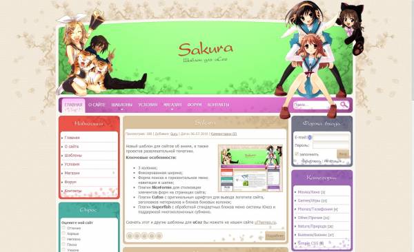 Sakura шаблон для Ucoz | 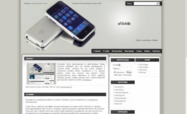 uMobile шаблон для Ucoz |
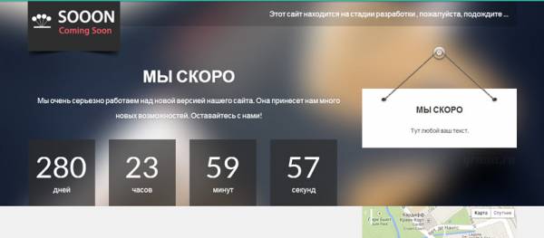
 Sparks шаблон для uCoz |  Объемный индикатор загрузки для сай... |
 Страница технических работ для uCoz... | 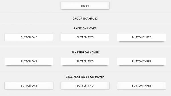 3d эффект бумажные кнопки |
| Всего комментариев: 0 | |
Disqus comments
comments powered by Disqus| HTML | |
| BB-Code | |
| Ссылка |
